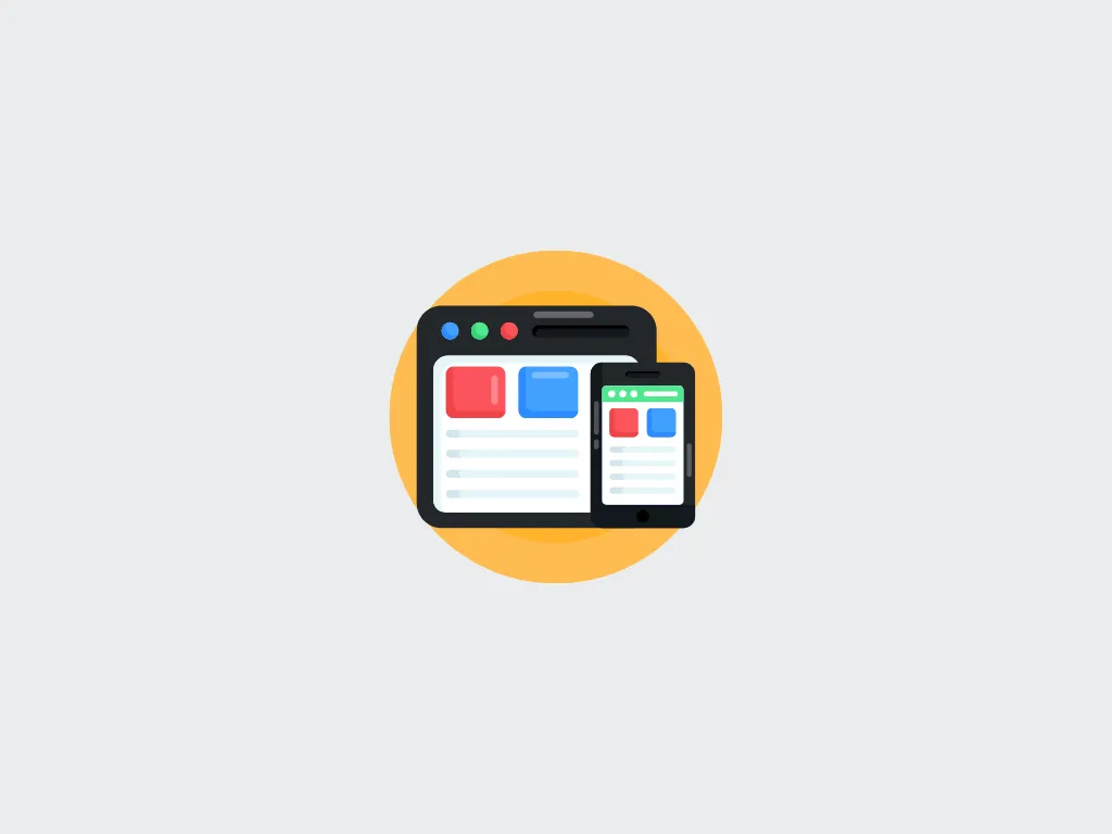
Responsive Mobile Site vs Adaptive Mobile Site
Choosing the right mobile web design approach is crucial for travel businesses. Both responsive and adaptive designs aim to deliver optimal user experiences across devices, but they work differently.
What is Responsive Design?
Responsive design uses flexible grids, fluid images, and CSS media queries to automatically adjust the layout based on screen size. A single HTML codebase serves all devices.
Advantages of Responsive Design
- Single codebase for all devices
- Easier to maintain and update
- Better for SEO (single URL)
- Future-proof for new screen sizes
- Lower development cost
Disadvantages of Responsive Design
- May load unnecessary resources on mobile
- Less control over device-specific experiences
- Can be slower on older devices
What is Adaptive Design?
Adaptive design uses predefined layouts for specific screen sizes (breakpoints). The server detects the device and serves the appropriate layout.
Advantages of Adaptive Design
- Optimized performance for each device
- More control over user experience per device
- Can load only necessary resources
- Better for complex applications
Disadvantages of Adaptive Design
- Higher development and maintenance cost
- Multiple codebases to manage
- May miss new device sizes
- More complex deployment
Which Should Travel Businesses Choose?
For most travel businesses, responsive design is the recommended approach. It offers better SEO, lower costs, and easier maintenance. However, if your business requires highly optimized mobile experiences with complex booking flows, adaptive design may be worth the investment.
Performance Considerations
Mobile performance is critical for travel websites. Users expect fast loading times, especially when searching for flights or hotels. Consider implementing lazy loading, image optimization, and caching strategies regardless of your design approach.
Conclusion
diji.tech builds responsive, high-performance travel websites that work seamlessly across all devices, ensuring your customers have the best experience whether on desktop or mobile.